The problem:
Byte already offers at-home clear teeth aligners. In September 2023, we also launched the Byte+ Hybrid Program, also known simply as Byte+, where you visit a local dentist for 3D scans, and then complete the rest of your straightening journey from home. At launch, Byte+ was only available in certain areas of the US, so we geotargeted users within 50 miles of a Byte+ provider, and showed those users Byte+-related content that encouraged them to click through to the Provider Locations page and choose a local dentist for their scans.
In April 2024, in the face of low engagement with this new product, we searched for ways to boost engagement. Our overarching goal was to drive eligible unique visitors to the Provider Locations page, allowing them to pick a local dentist to visit, without compromising our existing direct-to-consumer funnel.
The solution:
We put together a “pod” that included a product manager, a UX designer, and a UX writer (that’s me!). Our product manager led a team of developers who would complete the work once we came up with concepts. First, our pod conducted interviews to understand experiences and expectations. Then, we identified strengths and opportunities on existing Byte+ entry points. Finally, we created new Byte+ touchpoints:
A new Byte+ announcement bar
A revamped Byte+ landing page
A reworked quiz results page
A homepage “How Byte Works” module including info about Byte+
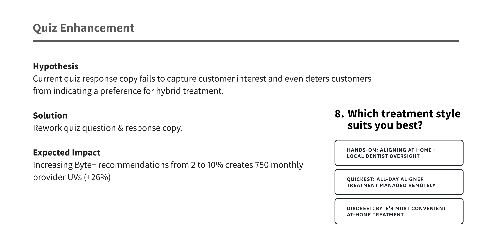
A reworked quiz question providing more info about Byte+
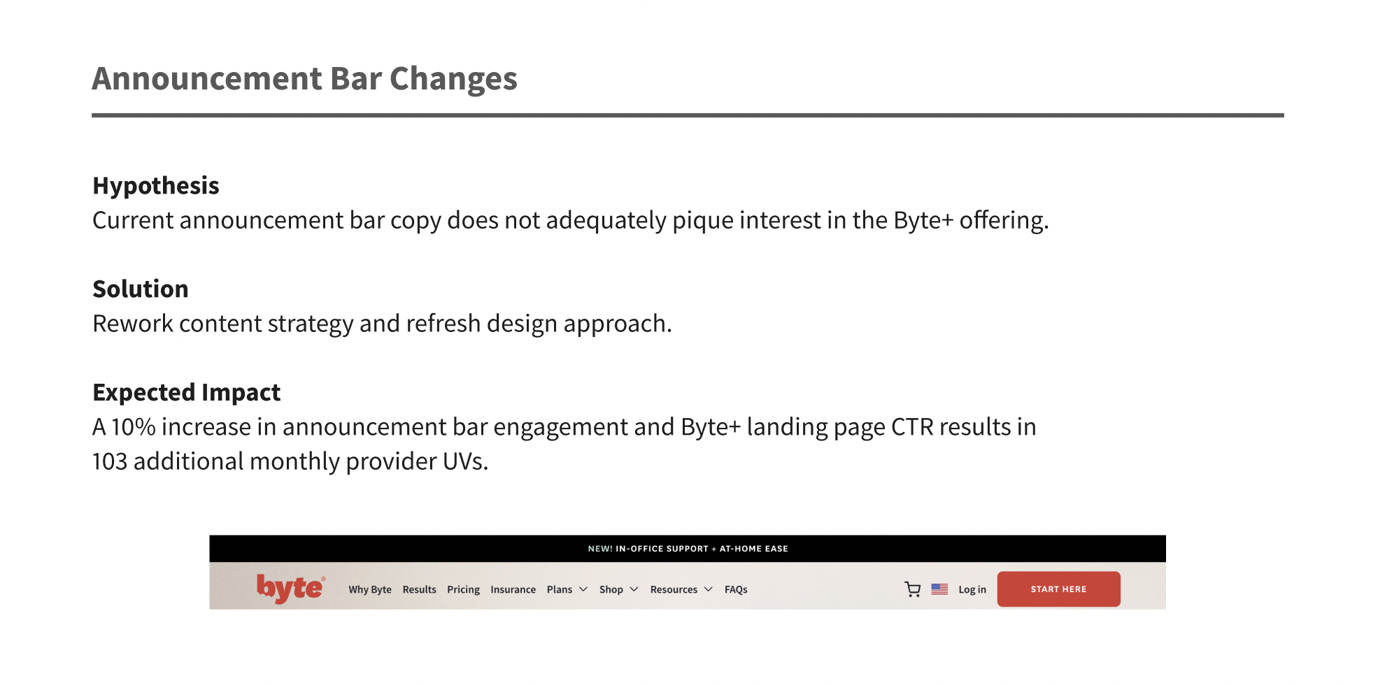
Byte+ announcement bar
For our first touchpoint, we addressed the announcement bar that had been created when Byte+ was launched. User research showed that prospective customers weren’t sure what the Byte+ offering included. We needed new copy.
Our existing announcement bar was confusing.
We redesigned the bar and reworked the copy to include more details about exactly what the Byte+ offering entailed.
Our reworked announcement bar was visually more exciting and explained more about the new offering.
We also added some nifty-looking animation to further highlight the announcement bar to users.
2. Byte+ landing page
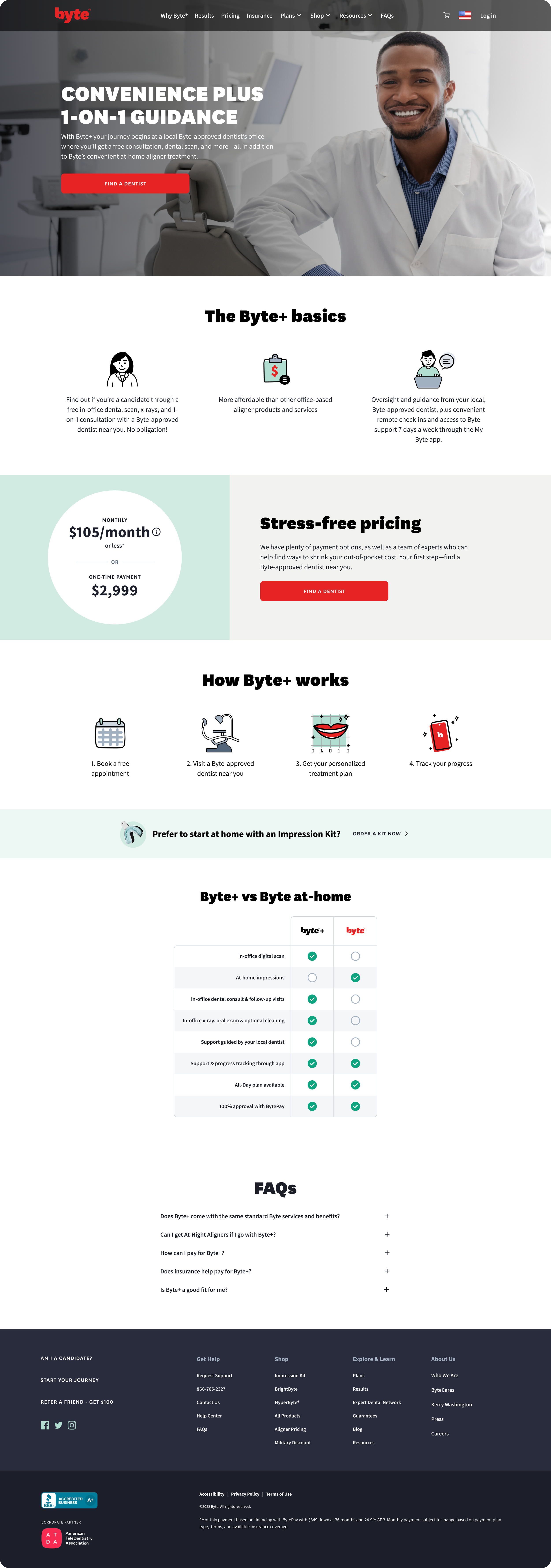
Next, we revamped the Byte+ landing page. Below is the landing page as designed at launch.
The old landing page didn’t describe Byte+ as well as it could.
With only 39% of landing page traffic continuing to the provider page, and with user research indicating that this page didn’t adequately describe Byte+, it was time for a revamp.
Our presentation to stakeholders laid out the issues with the landing page.
Here are some of the changes I made to the landing page copy:
I reworked the headline and subhead copy to more clearly spell out the differences, and similarities, between Byte and Byte+.
I removed the Byte+ Basics module because we were repeating some of the same information farther down the page in the How Byte+ Works module.
I went into more detail about payment options, rather than emphasizing that the user’s first step is to find a dentist. This seems counterintuitive, but it felt more important to be forthcoming about payment options rather than do what felt like brushing off the user in favor of getting them to click through.
I simplified the Byte+ vs. Byte At-Home chart to reduce the possibility of overwhelm and make it easier to digest at a glance.
The new landing page solved several issues with clarity and information overwhelm.
3. Quiz Results page
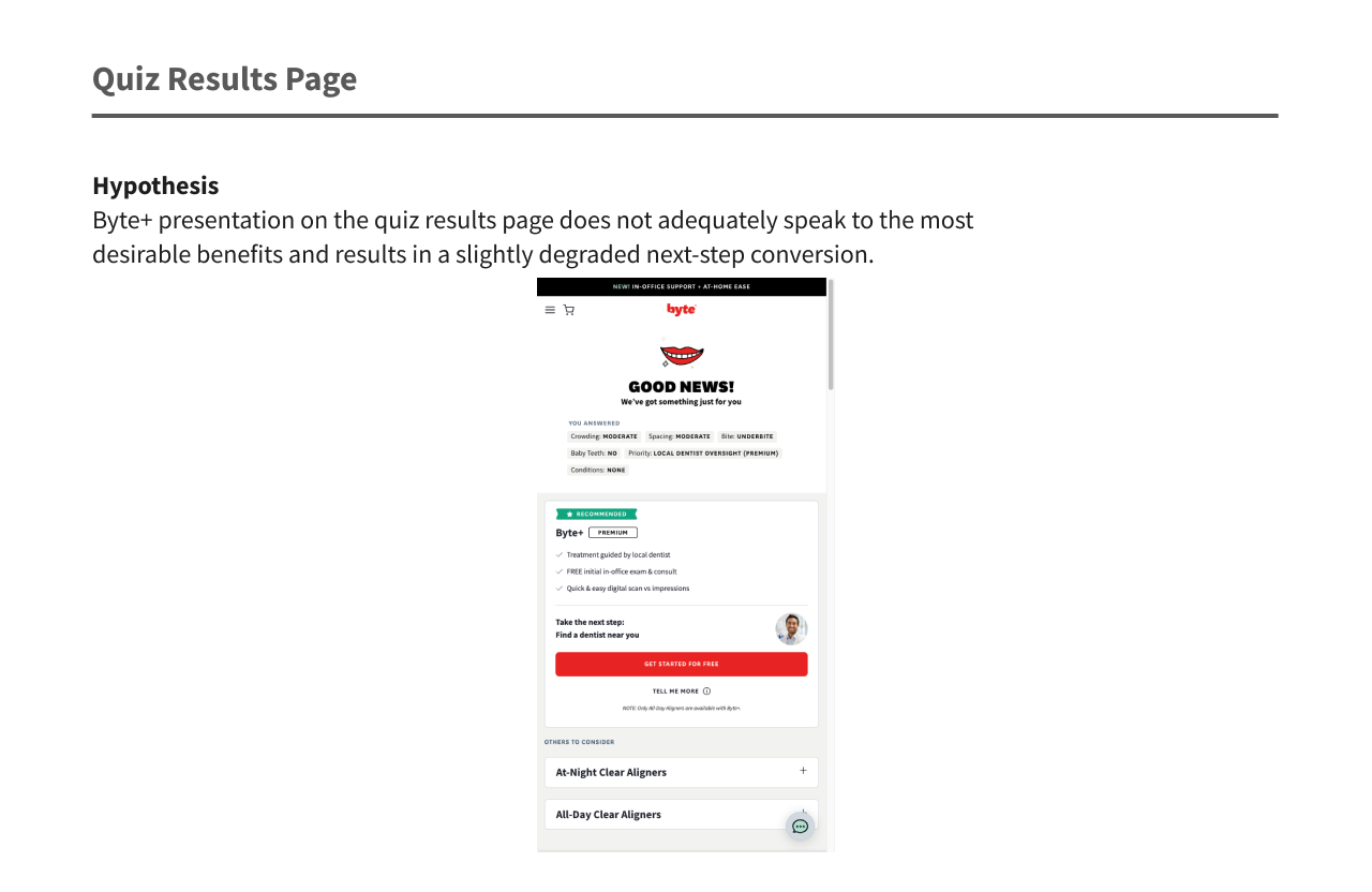
Next, we revamped our Quiz Results page. Visitors to Byte.com can take a quiz to see which Byte treatment option might work best for them. When their quiz answers pointed towards their being a good candidate for Byte+, we showed them a quiz results page describing the Byte+ offering. Here it is as it looked at launch.
Our presentation to stakeholders detailed the issues with the quiz results page.
While it’s a nice idea to show the customer what they answered, it distracts from the task at hand — seeing their results and moving toward selecting an offering. You can also see that this description of Byte+ leaves out an important detail: after the initial office visit, aligning happens at home. There’s also the Premium tag here — an attempt to alert the customer that they will receive more direct attention from their dentist. Or is it to alert them that this option will cost more? It’s unclear. Time for some reworking.
My reworking of this screen came with wins and losses for me.
For me, the reworking of this screen was a mixed bag. My wins:
I removed the Answers module to get to the recommended service faster.
I added “hybrid” to the description, to indicate this service also includes at-home aligning.
My losses:
I advocated for a different word to Premium — I suggested New. I was overruled by stakeholders who liked the dual implications of the word Premium as luxury and more costly.
I also advocated that we call this offering by its official name — Byte+ Hybrid Program — to better differentiate it from Byte At-Home, but was thwarted by character count in the designed card.
4. Homepage "How Byte Works" Byte+ Inclusion
For users who fell within range of a Byte+ provider, we wanted to show them a Byte+-inclusive version of the How Byte Works module on the homepage. Here is what they saw pre-revamp:
The How Byte Works module on the Byte homepage pre-revamp.
My challenge here was to keep character count low, especially because this is a module that already exists in Contentful, while still explaining how both Byte At-Home and Byte+ work.
The new version of the How Byte Works module, including information about Byte+.
I was especially proud that I managed to include Byte’s official name — the Byte+ Hybrid Program — without sacrificing too many characters. I was even more proud that I managed to convince our legal team to let me use “Byte+” instead of the full name in the next two columns of copy. Byte At-Home and Byte+ are FDA-regulated products, and thus must abide by strict legal rules.
5. Quiz Question 8
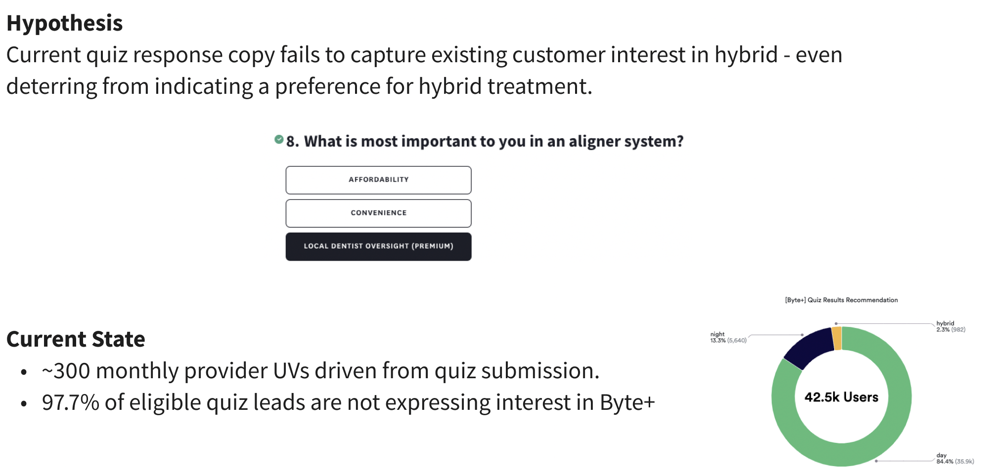
Quiz Question 8 is the part of the Byte quiz where we determine whether prospective patients would prefer Byte All-Day at-home aligners (our most affordable option), Byte At-Night aligners (our most convenient option) or Byte+ (with local dentist oversight).
This question was not clear enough to encourage quiz-takers to express interest in Byte+.
At launch, another copywriter had added the copy “Local dentist oversight (premium)” because we wanted to emphasize that your Byte+ dentist could remotely monitor your entire treatment. This copywriter also added the word Premium because they wanted to be transparent about the added cost of Byte+. However, this copy didn’t seem to resonate with prospective patients, only putting 2.3% of them into the Hybrid bucket post-quiz.
I reworked all three answers for Quiz Question 8.
I rewrote copy for all three answers for quiz question 8. My aim was to give the fullest possible explanation of each treatment option while keeping copy short enough to fit in a button.
The results:
Success! This presentation by our analytics team shows how we doubled conversion from April to July in getting interested users who were in a Byte+ location to drive into the Byte+ funnel, all while leaving our DTC funnel unaffected.
Bonus Touchpoints
In August 2024, we added another touchpoint.
Homepage Plans Card Module
On the Byte homepage, we show two cards detailing Byte All-Day and Byte At-Night aligners.
For Byte+ geotargeted users, we wanted to take the opportunity to show them Byte At-Home and Byte+ plan cards instead. I also took the opportunity to rewrite some old website copy to align with our updated brand voice and style guide.
The homepage shows All-Day and At-Night aligner plans.
Users who fit into the Byte+ geotargeting area see Byte At-Home and Byte+ plan cards.
The Touchpoint that Never Was
Alas, we ran out of time and bandwidth to execute some of our planned touchpoints before our priorities had to shift to other projects. Here’s a favorite of mine that didn’t end up going into production. If Byte+-geotargeted users clicked the main navigation menu CTA, they would be shown a modal asking about their preferred treatment style. They could then click the CTA that corresponded to their preferred offering — Byte At-Home or Byte+. I’m especially proud of the Step 1 and Customer Care headings - a concise and compelling way to explain the plan differences, in my opinion.
If geotargeted users click Start Here in the top left corner…
…they see this modal directing them to choose their preferred treatment style.

